 SKIBDRIP®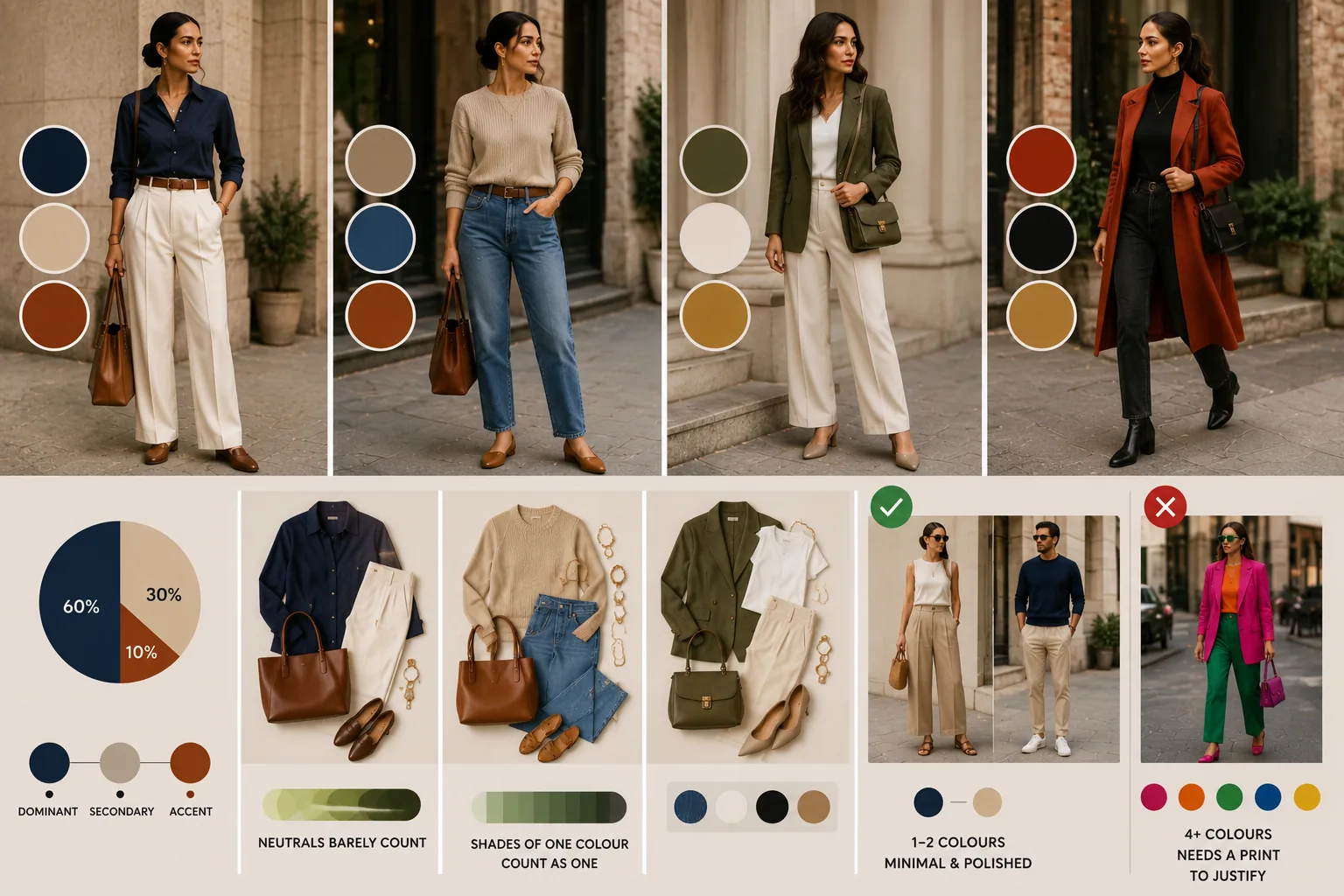
Why three works
The three-colour guideline survives because of how the eye reads an outfit. One colour is a statement. Two is a pairing. Three is a composition — dominant, support, accent — which is as much structure as a glance can organise. At four, the eye starts counting instead of admiring.
Interiors and graphic design use the same 60-30-10 split: sixty per cent dominant (usually your biggest garment), thirty secondary (the second garment or layer), ten accent (shoes, bag, lip, jewellery, a scarf). You do not need to measure. If one colour clearly leads and one clearly punctuates, the proportions are close enough. The rule is centuries older than fashion writing — painters balanced canvases on the same logic.
What counts as a colour
The rule gets easier once you know what it ignores.
- Neutrals — black, white, grey, navy, beige, tan, denim — count loosely; two neutrals plus two colours still reads calm
- Shades of one family count once: navy and ice blue are both blue
- Skin, and the metals in your jewellery, do not count
- Small prints count as their overall impression from across a room, not per motif
So jeans, white shirt, rust jumper and leopard flats is not four colours — it is denim and white as neutrals, rust as the colour, leopard reading tan. Comfortably within budget. When a piece genuinely straddles categories — a teal bag, a burgundy shoe — count it as colour and stay honest.
Dressing with one, two or three
Every count below the ceiling is a style in itself.
One colour — monochrome — is the most formal and the most lengthening; all black is its famous case, but head-to-toe camel or navy is softer and just as strong. Vary texture so it does not flatten.
Two colours make the classic pairings: navy-white, black-cream, olive-tan. Crisp and hard to fault.
Three is where personality enters — the accent is the styling. Make the ten per cent deliberate: the red shoe, the emerald dupatta, the mustard beanie. That small dose is why an outfit looks styled rather than merely assembled. If you photograph best at one count, make it a signature rather than forcing range.
When four or more works
The ceiling bends in three places. Prints arrive pre-mixed — a floral midi may hold six colours the designer already balanced; treat the whole print as one item and echo one of its colours elsewhere. Festive and traditional dressing runs richer palettes by design — a Banarasi saree with contrast blouse and gold is plural and correct, and the craft there is repetition, letting each colour appear twice. And deliberate maximalism works when the colours share one property — all jewel-deep, or all sherbet-pale — so the crowd reads as a chord.
The honest test in every case: does the eye rest anywhere. If yes, the count is fine, whatever it is. Trust the mirror over the arithmetic when the two argue.
A ten-second check at the mirror
Before leaving, count once: dominant, secondary, accent. Then apply the three quick fixes if something jars.
Too busy — convert one coloured piece to a neutral, usually shoes or bag. Too flat — add a ten-per-cent accent near the face or at the feet. Disconnected — repeat one existing colour somewhere small, the bag echoing the shirt, the lip echoing the print, so the outfit closes its own loop.
Repetition is the professional secret hiding inside the number: it is rarely the count that fails, it is colours that appear once and talk to nothing. Give each colour two appearances and even four behave. Ten seconds at the door saves a day of doubt.