 SKIBDRIP®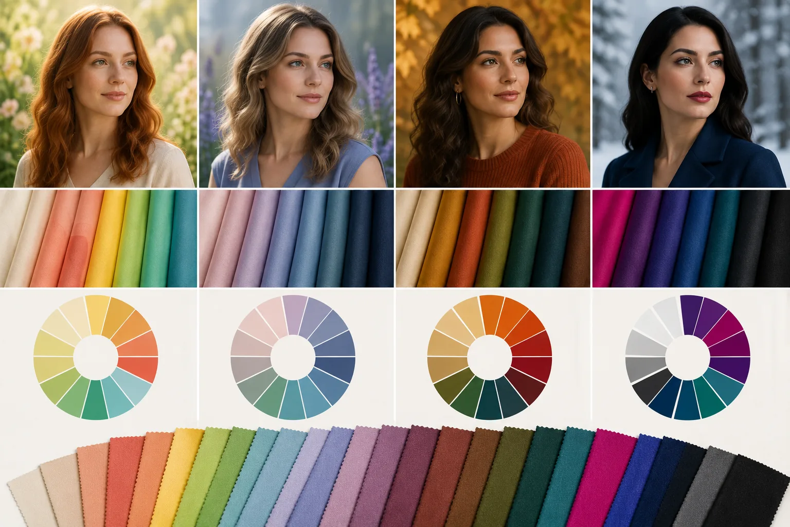
What the system actually measures
Strip the mystique and seasonal analysis measures three dimensions of your natural colouring — skin, eyes and hair taken together.
- Hue: does your colouring lean warm (golden) or cool (blue-pink)
- Value: is the overall effect light or deep
- Chroma: do you shine in clear, saturated colour or in soft, muted colour
Every person sits somewhere on those three axes; the seasons are just memorable names for the main combinations. The payoff is practical — colours that share your temperature, depth and clarity harmonise with your face instead of competing with it, so skin looks clearer, shadows soften and eyes read brighter.
The four seasons in one paragraph each
Spring is warm and clear: golden undertone with bright, fresh colour — coral, warm green, clear turquoise, ivory. Autumn is warm and muted: golden undertone with depth and richness — rust, olive, mustard, chocolate, bronze.
Summer is cool and soft: blue-pink undertone with gentle, dusty colour — powder blue, rose, mauve, soft white, grey. Winter is cool and clear: blue undertone with high contrast — black, pure white, sapphire, emerald, fuchsia, icy tones.
Notice the pairs. The two warm seasons split by clarity, and so do the two cool ones. That is the whole grid — temperature one way, brightness the other. Most people can place themselves in one half of the grid within minutes; the exact quarter takes the tests below.
Why twelve seasons exist
Real colouring rarely sits dead-centre in a season, so the modern system splits each into three by its dominant quality. Spring becomes Light, True and Bright Spring; Summer becomes Light, True and Soft Summer; Autumn becomes Soft, True and Deep Autumn; Winter becomes Bright, True and Deep Winter.
A Soft Autumn and a Deep Autumn share warmth and mutedness but differ in intensity — one blooms in gentle sage and camel, the other in espresso and burnt orange. Twelve labels sound fussy, but they exist to answer the honest complaint about the four-season version: most people sit near a border and suit parts of two palettes. If two sub-season palettes both seem right, wear the overlap — the shared colours are your safest dozen.
Find your season at a window
You can approximate a professional draping session at home in ten minutes of daylight.
First settle temperature with the undertone tests — gold versus silver, vein colour, which white flatters. Then depth: does black overwhelm you (lighter seasons) or frame you (deeper ones). Then clarity: hold something jewel-bright against your face, then something dusty — one will make your skin look cleaner, the other will make the garment look louder than you.
Photograph each test in identical light and compare the pairs side by side; the camera is more honest than the mirror's memory. Test with plain fabric rather than prints, and keep hair off the face so the colour meets skin directly.
Use it as a tool, not a cage
A season is a shortcut, not a sentence. Use it to shop faster — walk past the rails that fight you — and to explain twenty years of mysterious compliments. Build the colours near your face from your palette, keep bottoms and shoes free, and break the rules knowingly whenever love outvotes theory.
Be sceptical of absolutes: hair dye and makeup shift the picture at the edges, and many people genuinely straddle seasons. If a Winter adores mustard, she can wear it — in the trouser, in the bag, or with a berry lip restoring the balance. The palette serves you, never the reverse. Ten well-chosen colours you actually wear beat forty correct ones you avoid.