 SKIBDRIP®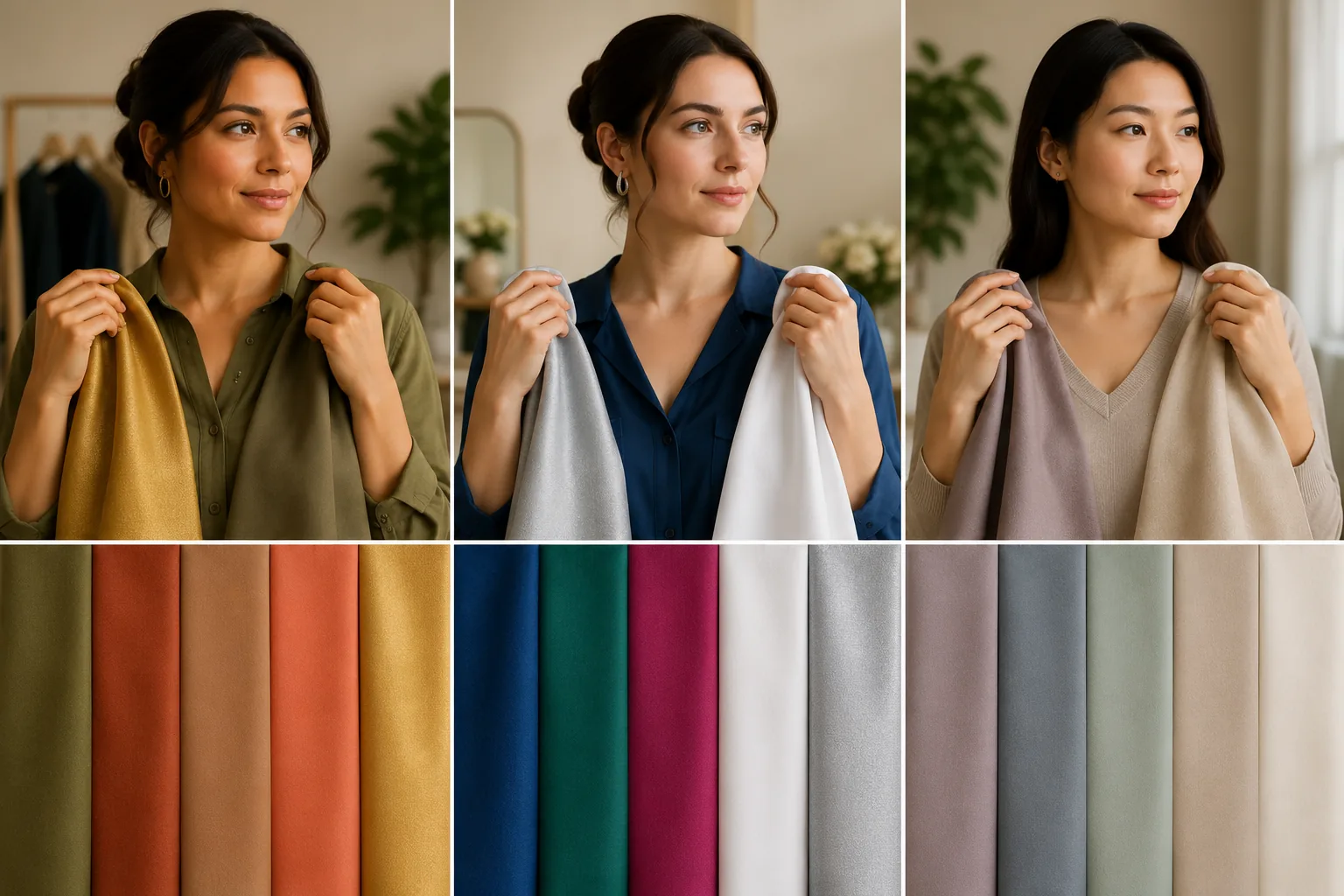
Undertone versus depth: the distinction that unlocks it
Skin has two properties that matter for colour. Depth is how light or deep your skin is — fair, medium, dusky, deep. Undertone is the temperature underneath — warm (golden, peachy, yellow-based), cool (pink, red or blue-based) or neutral (a genuine mix).
Undertone is the one that decides whether a colour flatters, and it does not change with tanning. Two people of the same depth can suit opposite palettes; deep skin can be cool, fair skin can be warm — every combination exists across India and everywhere else. Find the undertone first and the rest becomes a checklist you can shop from. It also explains years of mystery: why one red works and another does not, and why a friend's favourite colour drains you.
Find your undertone in daylight
Three quick checks, best done at a window without makeup.
- Jewellery: if gold flatters more, you lean warm; if silver, cool; if both honestly work, neutral
- Veins at the wrist: greenish suggests warm, blue-purple suggests cool, a mix suggests neutral
- Whites: cream flattering you says warm; brilliant optic white says cool
No single test is conclusive — run all three and take the majority. The full undertone method goes deeper, but two minutes at a window settles most cases well enough to shop that same afternoon. Do the tests at a north-facing window if you can — direct sun warms everything and skews the read.
Warm undertones: your palette
If you run warm, colours with yellow or gold in their base make skin look lit from within.
Reach for olive, khaki, rust, terracotta, tomato red, coral, peach, mustard, marigold, warm browns from tan to chocolate, cream and camel instead of stark white, and gold in metals and embellishment. Turquoise and teal are your blues; warm greens are your safest brights.
Handle with care: icy pastels, blue-reds, cool greys and brilliant white close to the face can flatten warmth into sallowness. You need not abandon them — keep them below the collarbone and put a warm shade at the neckline instead. Your white is cream, and your softest black is really chocolate or deep olive — both sit kinder against golden skin.
Cool undertones: your palette
If you run cool, colours with blue in their base make skin look clear and rested.
Your list: navy, cobalt, sapphire, emerald, true white, charcoal, pure black, berry, plum, fuchsia, cherry red, lavender, icy pastels, and silver, platinum or white gold in metals. Pink almost always works in some strength, from blush to magenta.
Be careful with orange, mustard, warm beige and olive worn at the face — they can pull cool skin grey or tired. The fix is the same in reverse: send warm shades to trousers, skirts and shoes, and let a cool colour sit near your face where it does the flattering. Your white is the brilliant one, and true black is yours in a way it never quite is for warm undertones.
Use it without replacing your wardrobe
This knowledge costs nothing to apply. Tonight, sort your tops — not your whole wardrobe — into flattering and fighting. Tomorrow, wear the fighting colours away from your face: as bottoms, layered under, or lifted with a scarf, collar or necklace stack in your metal.
When you shop next, buy tops and dupattas only in your palette; bottoms and shoes are colour-agnostic. Within a season the wardrobe converts itself. And treat every rule as a lever, not a law — if a forbidden colour makes you happy, wear it and add the right lipstick. Joy photographs better than theory, and the palette is a default, not a fence.