 SKIBDRIP®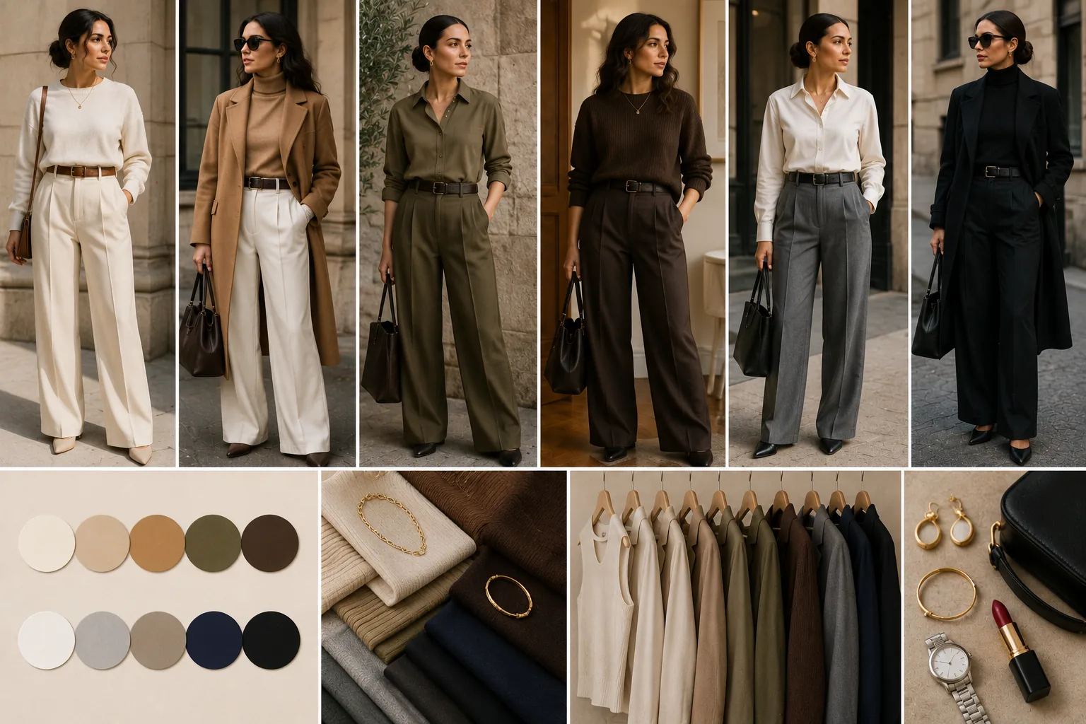
Neutrals are colours with manners
A neutral is any colour that agrees with almost everything: the true neutrals — black, white, grey, beige — plus the honorary ones fashion treats identically: navy, camel, olive, chocolate, denim, and the skin-adjacent run from ecru to espresso.
Their power is combinatorial. A wardrobe of twelve neutral pieces produces more wearable outfits than twenty pieces in scattered colours, because every hanger agrees with every other — which is why capsule wardrobes are built on them. The risk is blandness, and the rest of this page is the three levers that prevent it: temperature, depth, texture. Master those three and the palette that looks safest on the rail becomes the one that draws quiet compliments in the room.
Choose your temperature first
Neutrals split by undertone, and mixing the families carelessly is why some beige outfits look muddy.
Warm family: cream, ivory, ecru, camel, tan, caramel, olive, khaki, chocolate and greige — the warm grey. Cool family: optic white, icy grey, charcoal, black, navy, taupe and cool stone.
Let your undertone pick your home family — warm skin glows in the camel spectrum, cool skin sharpens in the grey-navy spectrum. Cross-temperature works when deliberate; navy with camel is a classic precisely for that tension. But within one outfit, keep one family clearly in charge. Denim, as ever, is bilingual and joins either family without complaint.
Stack three depths
The fastest neutral formula: one light, one mid, one dark, in any order.
- Cream knit, camel trousers, chocolate boots
- White shirt, grey trousers, black loafers
- Ecru kurta, tan palazzo, bronze sandals
- Stone tee, olive chinos, dark brown belt and shoes
The depth steps do what contrast colours normally do — they give the eye a path. All-light and all-dark columns also work, but they lean harder on the next lever, texture. If a neutral outfit looks flat in the mirror, the depths are too close; swap one piece a shade darker or lighter and look again. Shoes count as a depth too — a chocolate boot can be the dark note the outfit was missing.
Texture is compulsory, not optional
In colourful dressing, texture is garnish. In neutrals, it is the main course.
Combine at least three surfaces per outfit: cable knit against poplin, suede against denim, linen against leather, satin against wool. Ribbed, brushed, woven, polished — each catches light differently, and that variation is what reads as richness across a room and in photographs.
Fabric quality shows more here too, since nothing distracts from it; this is the palette where the better cotton earns its price. Grooming likewise: on quiet colours, a pressed collar and clean shoes carry disproportionate weight, and creases read twice as loud. Steam or iron before leaving; neutrals forgive nothing they can display.
Finish with one deliberate note
A neutral outfit is a sentence awaiting punctuation. Add exactly one mark: gold hoops, a silver cuff, a leopard flat — leopard behaves as a neutral accent — a red lip, a green silk scarf, a cognac bag.
One note reads as taste; three read as retreat from the concept. Rotate the note daily and the same five neutral pieces feel like a different outfit each morning — which is the entire economy of the neutral wardrobe: the base holds still, the punctuation moves. Boring was never the palette's fault. It was a missing texture, a missing depth step, or a missing full stop. Build the base once, then let the accents carry the seasons — marigold for festive weeks, deep green for winter, cherry for days that need lifting.