 SKIBDRIP®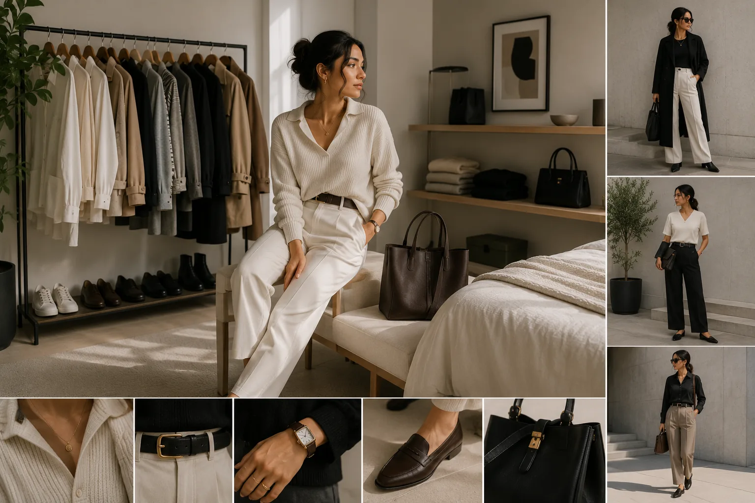
Minimalism is editing, not absence
The common mistake reads minimalism as subtraction until nothing is left — grey tee, grey trousers, white shoe, personality removed for hygiene. That is not minimalist dressing; that is giving up with a good conscience.
Proper minimalism is editorial. Every element that survives the cut has a job — a line, a proportion, a texture — and because so few elements remain, each one is louder. A minimal outfit is actually the most exposed kind of dressing: nothing distracts from a bad fit, a tired fabric or a wrong hem.
Which is the reframe that fixes boring: the question is never what else can I remove but does everything remaining speak. Three eloquent pieces beat seven mumbling ones — and beat three mute ones just as thoroughly.
Texture does the talking
Strip away colour and print, and texture becomes your entire vocabulary. Flat outfits are usually texture-starved: one smooth cotton against another, nothing for light to do.
Build every minimal outfit around at least one texture contrast:
- Chunky knit against smooth tailored wool
- Crisp poplin under soft brushed flannel
- Leather — shoe, belt, bag — against matte cotton
- Linen's slub against clean denim
- Silk or satin sheen against everything else
In a single-colour look, double the contrasts: an ivory cable knit with ivory fluid trousers works because the surfaces argue while the colour agrees. This is why expensive-looking minimalism is really fabric-shopping in disguise — the hand and weight of the cloth are doing the talking that print used to do.
Silhouette and proportion are the plot
With colour quiet, the shape of the outfit becomes the story. Flat minimalism puts everything in the same middle register — medium fit top, medium fit trouser, nothing happening.
The fix is one deliberate proportion move per outfit: wide fluid trousers under a compact knit; an oversized shirt over slim bottoms; a longline coat over a short hem; a cropped jacket against high-waisted volume. One garment gets the volume, its neighbour holds the line — that tension is what makes a two-colour outfit photograph like a decision.
Keep the moves singular. Volume everywhere is a costume; sharpness everywhere is a uniform. One considered contrast in silhouette does what a print would have done, at higher sophistication.
A palette with a pulse
Minimalist does not mean monochrome grief. The palettes that stay interesting have a structure: two or three neutrals plus one pulse.
The neutrals do the assembling — a neutral base of navy, ecru, grey, camel, black in your best-suiting temperatures. The pulse is a single deep accent that recurs across the wardrobe: oxblood, forest, ochre, a specific faded indigo. One pulse colour, appearing as a knit here, a sock or scarf there, gives a minimal wardrobe recognisability without breaking its calm.
Tonal dressing is the advanced move: one hue, three depths — camel, tan, cream — which reads rich precisely because it is harder than contrast. Boring is never the palette's size; it is the palette having no favourite.
Details carry the remaining weight
In a maximal outfit, details drown. In a minimal one they headline — which makes them the cheapest place to stop being boring.
The shoe decides the sentence: the same grey-knit-and-trouser outfit ends as corporate with black derbies, contemporary with clean white leather, characterful with a colour-pulse trainer or a mojari. Hardware and finishing speak next — a good watch, one ring or earring, a belt agreeing with the shoe, buttons that are not plastic apologies. Grooming and upkeep close the loop: pressed, de-pilled, hems exact, because minimalism has nowhere to hide neglect.
One detail as signature, repeated daily, and the simplest wardrobe becomes identifiably yours — which is the entire answer to boring.